Physical Expression focuses on restoration, transformation, and mind-action harmony, creating an urban body-mind healing space through professional training.
Design serves:
Women (20–45): professional, refined, comfortable
Teens (9–18): vibrant, approachable
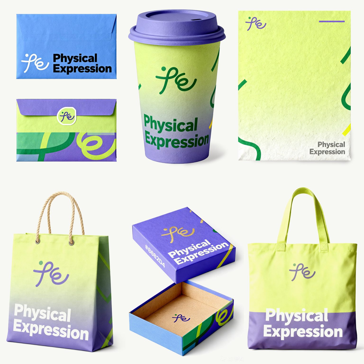
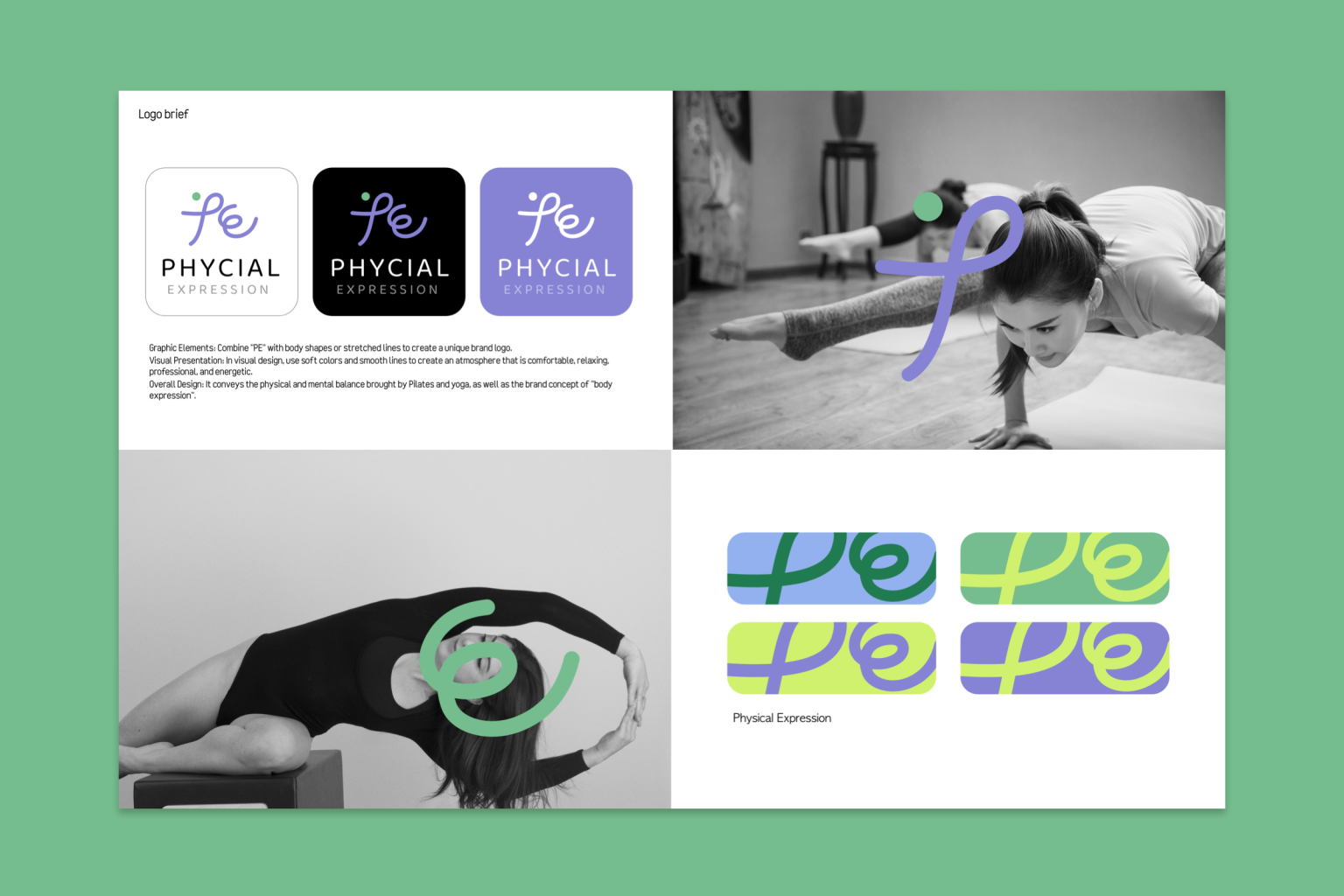
The “PE” logo combines Pilates motion in “P” and stretching lines in “E”, with a minimalist style.
Colors: mint/light grass green (relaxation), pale lavender/gray-purple (transformation), off-white/light apricot (clarity).
Smooth lines, soft textures, and open space convey minimalist elegance, expressing body language and mind-action harmony for a unified brand experience.